


- HOME
- SCIENCE
- HIGHLIGHTS
- DATA & MAPS
- DATA FOR YOU
- MEETINGS
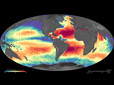
New daily maps show seasonal variations in salinity in the oceans of the world. Data range from September 2011 to August 2013. Purples and blues represent lower salinity, reds and oranges represent higher salinities.
View visualization on the NASA SVS website.
(00:00:24) Credit: NASA.Watch Movie »
👋 Hello, Explorer!
I'm the NASA Salinity Assistant. Ask me anything about ocean salinity, missions, and data!
👋 Welcome to NASA Salinity AI Assistant!
I know everything about this website — missions, data, science, publications and more. What would you like to know?
Powered by · NASA Salinity