


- HOME
- SCIENCE
- HIGHLIGHTS
- DATA & MAPS
- DATA FOR YOU
- MEETINGS
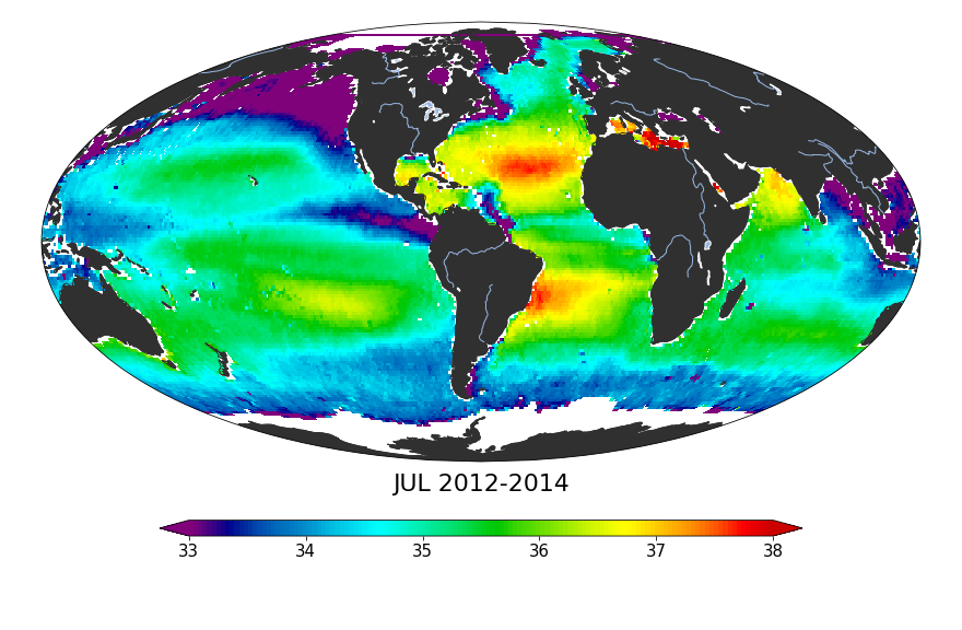
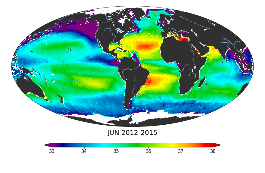
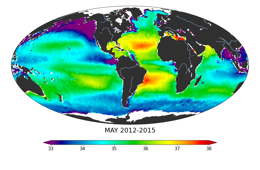
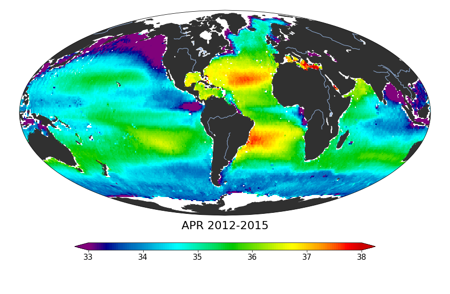
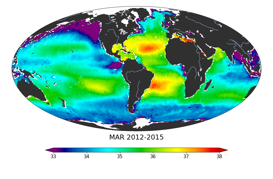
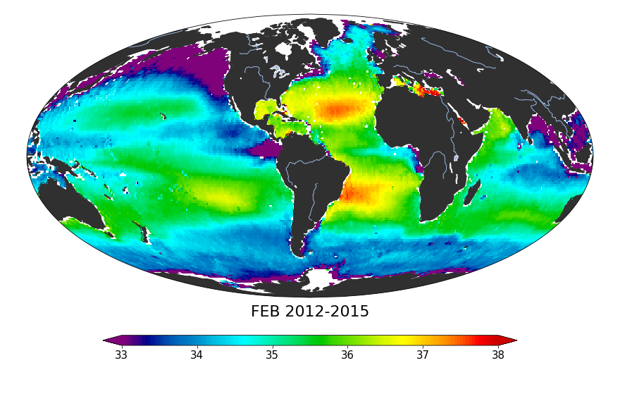
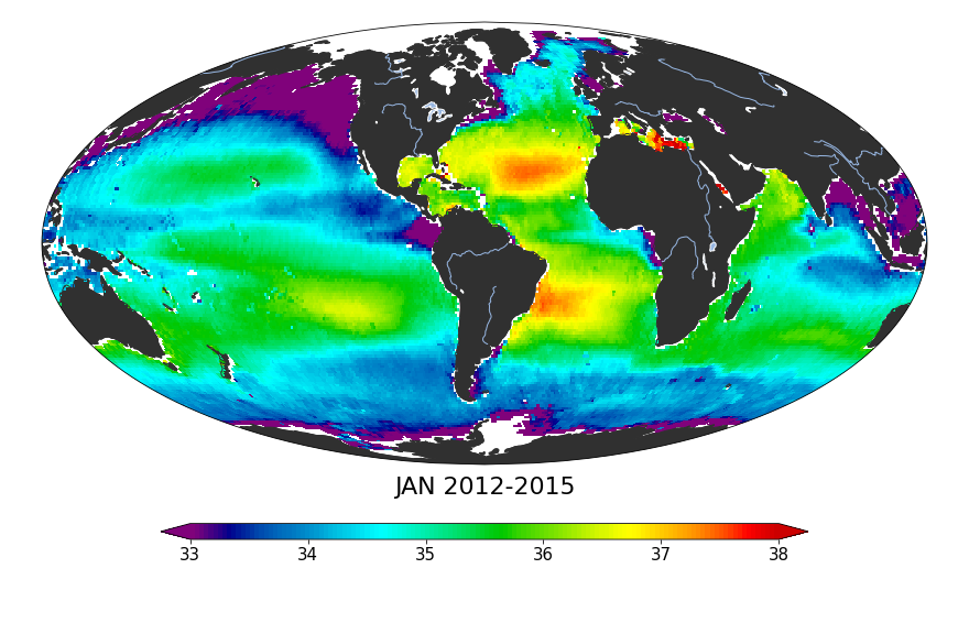
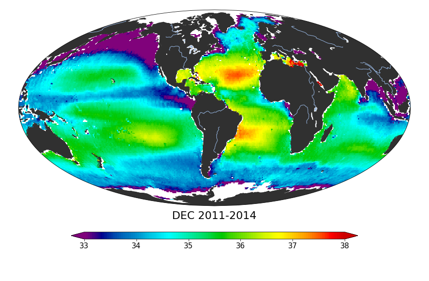
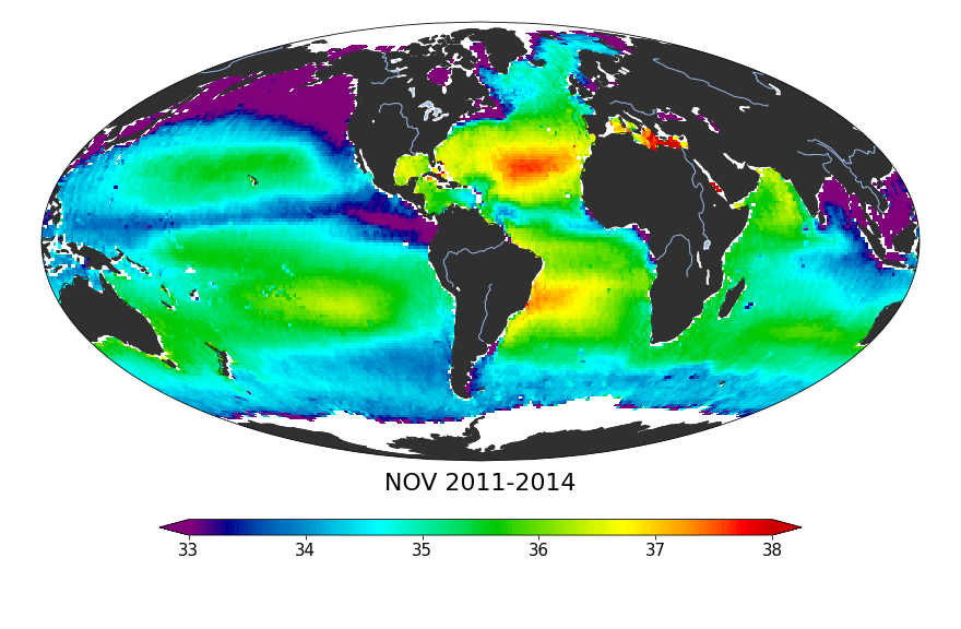
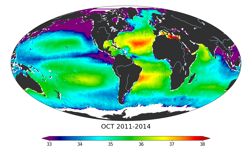
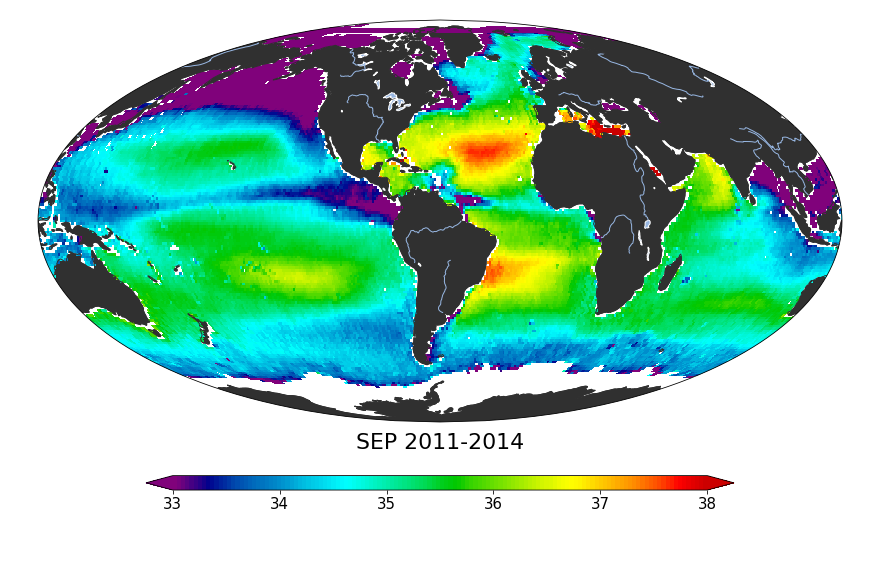
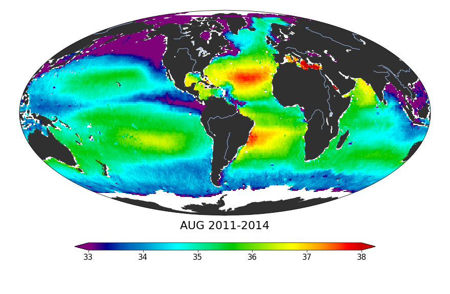
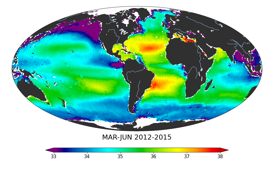
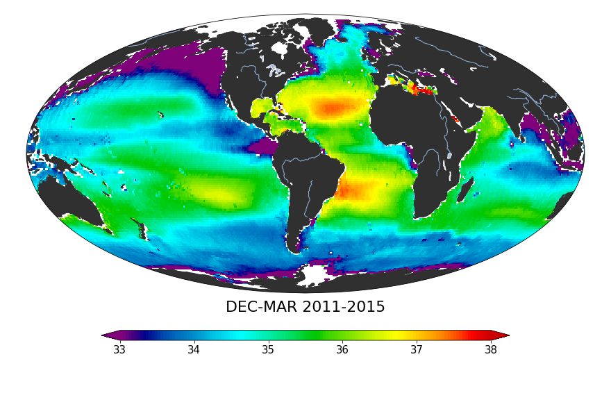
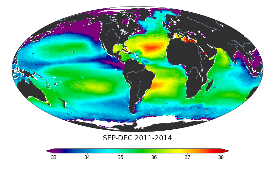
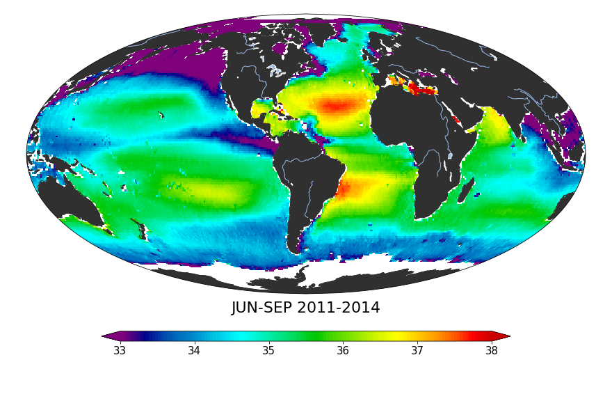
These composite maps show global sea surface salinity averaged by month and by season. Click on the images (below) for a closer view.
In these maps, reds show higher salinity (38 grams per kilogram) and purples show relatively low salinity (33 grams per kilogram).
V5 is based on the latest algorithms developed by the Aquarius Calibration/Validation working group. These maps are produced using Python library packages cartopy and matplotlib.

👋 Hello, Explorer!
I'm the NASA Salinity Assistant. Ask me anything about ocean salinity, missions, and data!
👋 Welcome to NASA Salinity AI Assistant!
I know everything about this website — missions, data, science, publications and more. What would you like to know?
Powered by · NASA Salinity