
First Light Map
Alt Tag: Global map of ocean salinity.
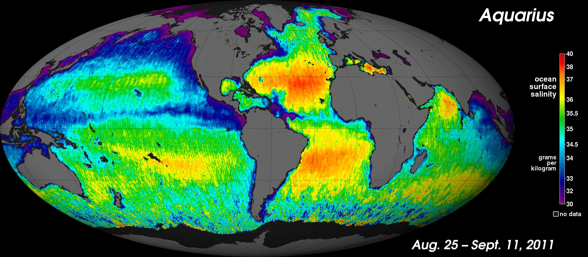
Description: This is NASA's first map of global ocean surface salinity, a composite of the first two and a half weeks of data after the Aquarius instrument became operational on August 25, 2011. The numerical values represent salt concentration in parts per thousand (grams of salt per kilogram of sea water). Yellow and red colors represent areas of higher salinity, with blues and purples indicating areas of lower salinity. Areas colored black are gaps in the data. The average salinity of the global ocean is about 35 (parts per thousand). Credit: NASA/JPL-Caltech/GSFC.